Hyundai Infotainment System
Project Scope
Evaluate the navigation usability for Hyundai’s infotainment system prototype.
Team
Graduate Students
My Role
Researcher
Methods
Task Analysis &
Questionnaire
Heuristic Evaluation
Discovery Process
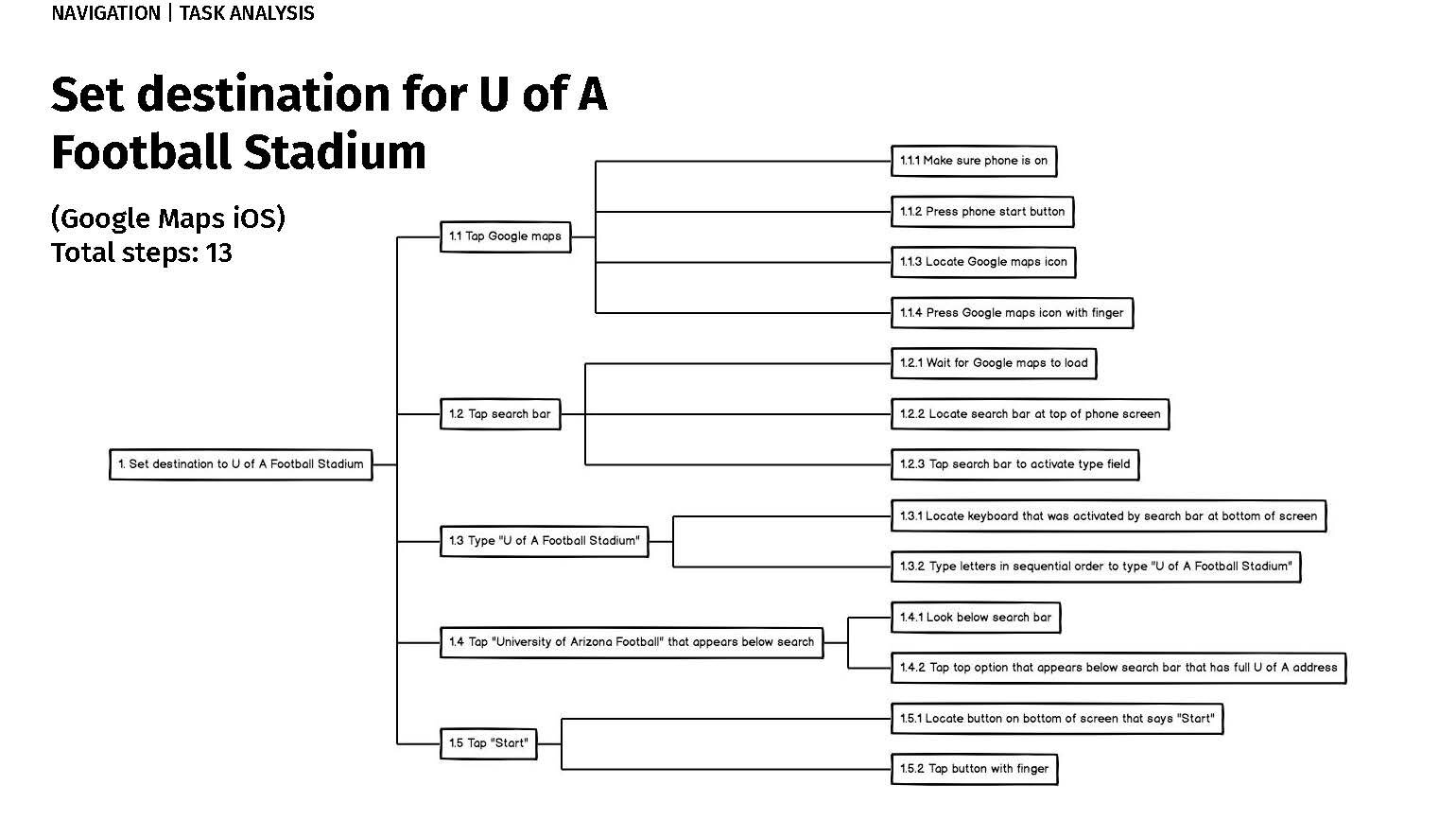
Task Analysis
We tested three navigation tasks, encouraging users to think out loud.
We observed and recorded their behaviors and comments.
Users completed a post-test questionnaire.
Tasks:
Set a destination from Ypsilanti, MI, to the University of Arizona Football Stadium in Tucson, AZ.
During the trip, locate and select the nearest Starbucks for a stop.
Save this Starbucks location as a favorite.
2. Heuristic Analysis
We utilized a standard set of heuristics to identify and rate usability issues on a scale from 1 to 3 (with 3 being the most severe). Of these, modals and route-setting scored the worst.
Modals alerted users to errors without providing clear guidance for resolution, earning a severity rating of 3.
Similarly, setting routes required full manual entry of destination details with no autofill or reliable voice recognition, leading to significant user frustration and a severity rating of 2.
Findings and Recommendations
Simplify route input and improve modal functionality with clearer solutions & dismissal options to enhance usability and safety.
Make buttons larger and display them more prominently so that navigation tasks don’t hinder the driver’s attention.
Replace zoom icons (+/-) with a magnifying glass icon so that functionality is more clearly understood
Consider adding an option for adding a waypoint, such as a (+) icon.
Remove “NAV” from navigation volume screen - several users thought it had to do with map navigation.


